Analysis of Swarm MAG HR data (50Hz)#
For more information about the data and other ways to access it, see:
import datetime as dt
import matplotlib.pyplot as plt
import numpy as np

from swarmpal.io import create_paldata, PalDataItem
from swarmpal.toolboxes import tfa
Fetching data#
Fetching data is much the same as before, switching “LR” for “HR”. Note that the data volume is 50 times larger so processing will take longer! It’s also appropriate to use a shorter time padding.
data_params = dict(
    collection="SW_OPER_MAGB_HR_1B",
    measurements=["B_NEC"],
    models=["Model=CHAOS"],
    auxiliaries=["QDLat", "MLT"],
    start_time=dt.datetime(2015, 3, 14, 12, 5, 0),
    end_time=dt.datetime(2015, 3, 14, 12, 30, 0),
    pad_times=(dt.timedelta(minutes=10), dt.timedelta(minutes=10)),
    server_url="https://vires.services/ows",
    options=dict(asynchronous=False, show_progress=False),
)
data = create_paldata(PalDataItem.from_vires(**data_params))
Processing#
Here we need to identify the different sampling rate sampling_rate=50, and we will also choose to instead use the vector magnitude rather than a single component (use_magnitude=True).
p1 = tfa.processes.Preprocess()
p1.set_config(
    dataset="SW_OPER_MAGB_HR_1B",
    active_variable="B_NEC_res_Model",
    sampling_rate=50,
    remove_model=True,
    use_magnitude=True,
)
p2 = tfa.processes.Clean()
p2.set_config(
    window_size=300,
    method="iqr",
    multiplier=1,
)
p3 = tfa.processes.Filter()
p3.set_config(
    cutoff_frequency=0.1,
)
p4 = tfa.processes.Wavelet()
p4.set_config(
    min_frequency=1,
    max_frequency=25,
    dj=0.1,
)
p1(data)
p2(data)
p3(data)
p4(data);
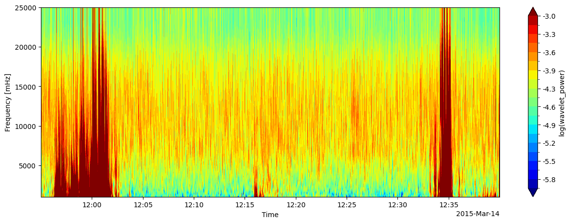
Plotting#
A couple of other tricks with the plotting function:
Create a figure directly with matplotlib then pass an
Axesobject withax=axto the function to direct the plot onto that figureCustomise the range and number of levels used in the spectrum colour bar
fig, ax = plt.subplots(1, 1, figsize=(15, 5))
tfa.plotting.spectrum(data, levels=np.linspace(-6, -3, 20), ax=ax)
(None, <Axes: xlabel='Time', ylabel='Frequency [mHz]'>)